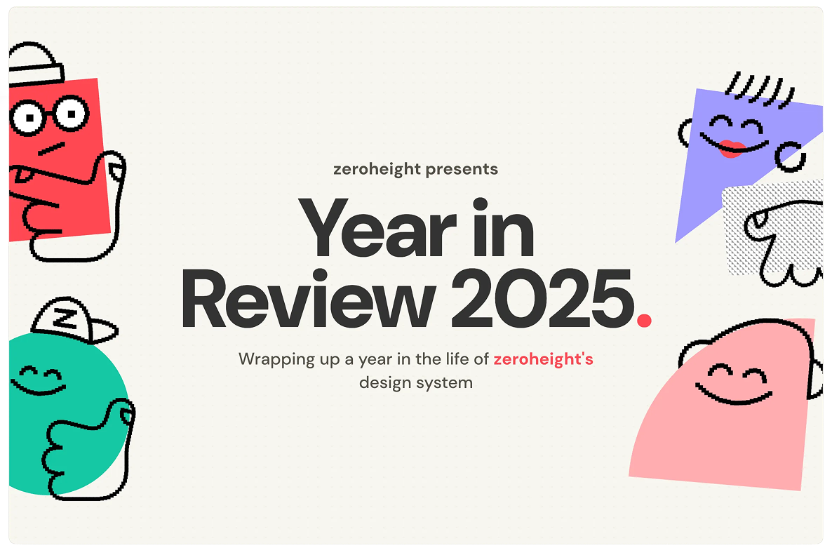
Year in Review
Introduction
Every year since 2021, zeroheight has sent customers a Year in Review: a personalised snapshot of how they’ve used the platform over the past twelve months. It started as a simple static image, generated via mail merge and delivered by email. It worked, but it was manual, time-consuming, and not particularly shareable.
In 2025, with a fresh rebrand under our belt and a point to prove, I decided to rethink the whole thing. The result was a fully dynamic, personalised web experience: real data, real interactions, tailored content based on each customer’s tier and feature usage. Built as a side project in two weeks using Astro, Hex AI, and Cursor, it brought a bit of Spotify Wrapped energy to B2B software.
This case study covers how we got there: learning from past versions, shaping a new approach, leaning into the rebrand, and building something that more than doubled our usual engagement rates.
Building on past versions
zeroheight’s Year in Review started back in 2021 as a static affair. The idea was simple: give existing customers a snapshot of their usage over the year, while quietly highlighting features they might not be taking full advantage of. It served as both a thank you and a gentle nudge towards upgrading.
The format was straightforward. Static images were generated via mail merge, pulling in customer data and outputting personalised graphics that went out via email to a subset of customers. It worked, but it was extremely manual. Every year meant a lot of tweaking, a lot of fiddling with data, and a lot of time spent on a process that didn’t scale gracefully. And because the output lived in email, it wasn’t exactly shareable. You’d get your Year in Review, maybe smile at the numbers, and that was it.
Despite the limitations, people genuinely loved it. That was the part worth holding onto.
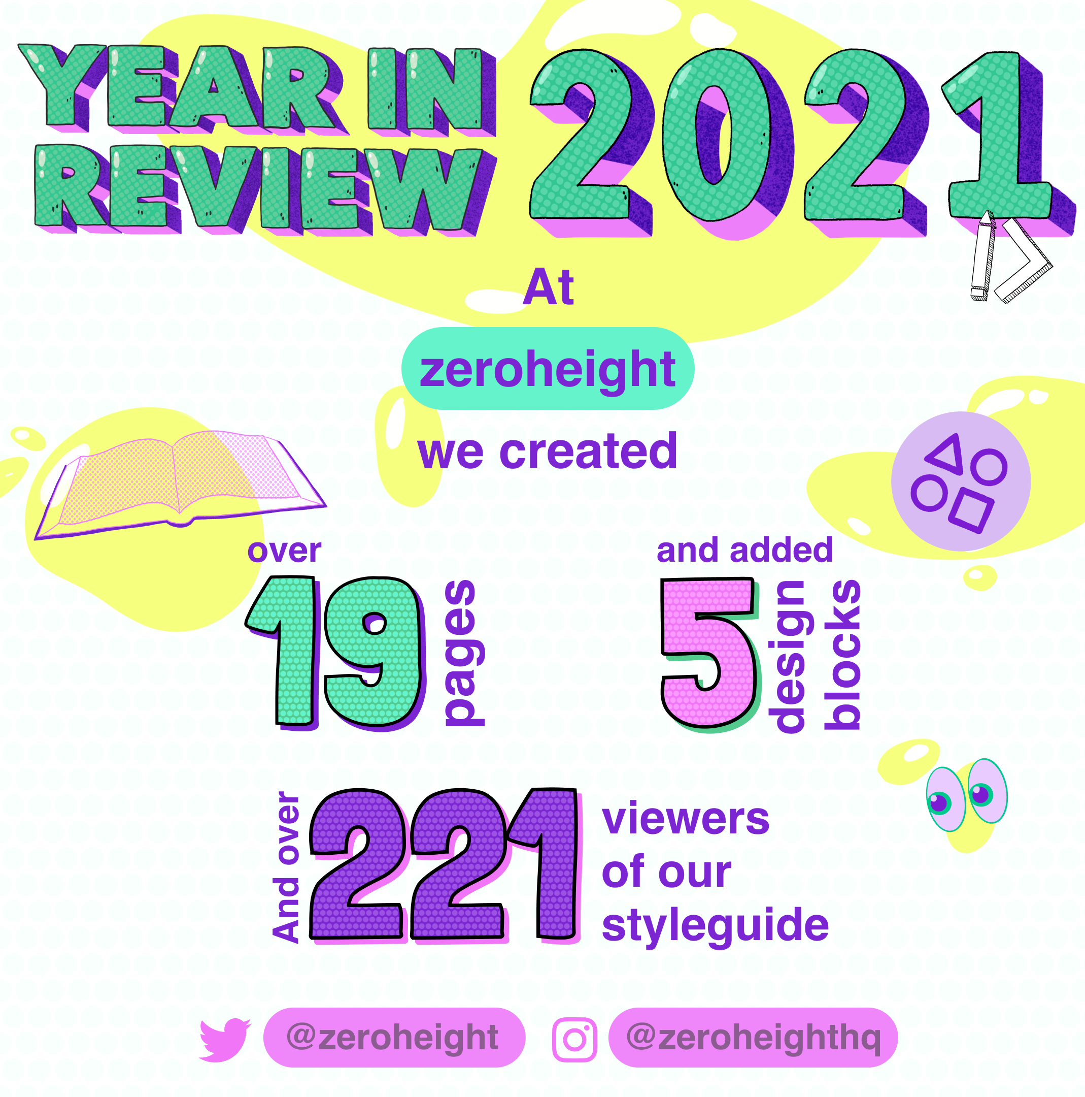
Previous iterations of the Year in Review were static images generated via mail merge.
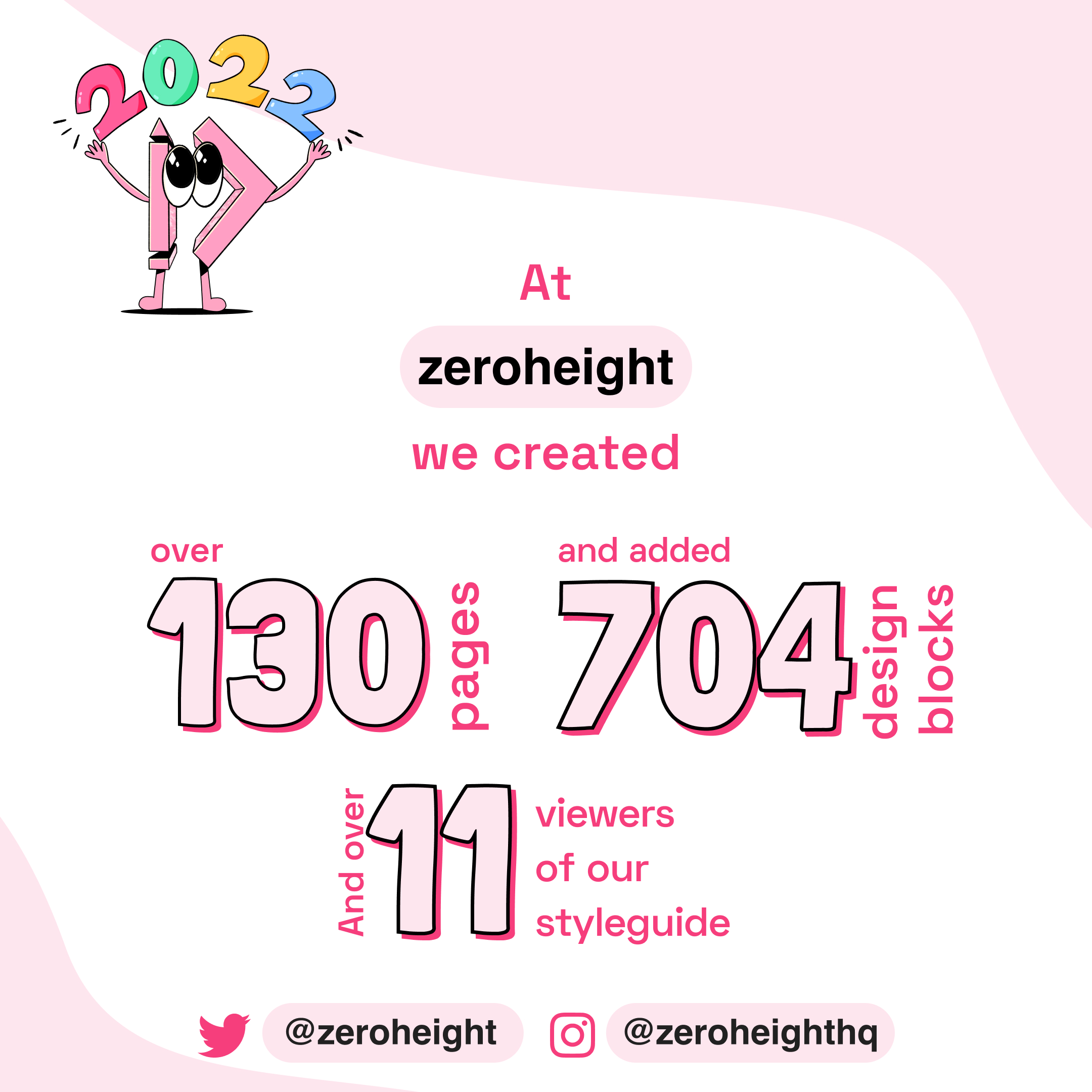
While these worked fine, they were limited by design: hard to scale, hard to share, and stuck in an inbox.
A new approach
We knew we could do better. The static format had served us well, but it was limited by design: hard to scale, hard to share, and stuck in an inbox. With zeroheight’s full rebrand landing in 2025, there was an opportunity to level up the Year in Review to match the ambition we’d shown on the new website.
The core idea was to move from static images to a fully dynamic page. Instead of generating graphics via mail merge, we’d pull real customer data into an interactive experience with animations and transitions, then share a unique URL with each customer. This opened up possibilities that weren’t available before. We could tailor content based on who the customer was and what tier they were on, baking in contextual upsells and nudges to re-engage with features they’d overlooked. Same concept, far more flexibility.
The inspiration was Spotify Wrapped. Yes, we’re a B2B company, and yes, enterprise software doesn’t usually get the same treatment as music streaming. But there was no reason we couldn’t bring some of that energy to what we were doing.
I shaped the whole thing as a side project, handling design, front-end code, and data wrangling myself. AI tooling played a big part: Hex AI for working with the data, Cursor for accelerating the build. It was scrappy, but it meant we could move fast and keep the scope tight.
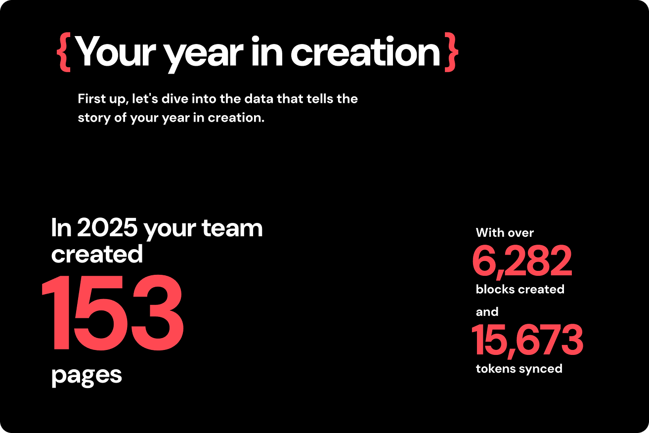
The Year in Review 2025 is built from real data, tailored to each customer and their usage.

We expanded our suite of characters to give the Year in Review a bit more personality.
Showing off the brand
zeroheight rebranded in 2025, the first major refresh since launching in 2015. The new brand and website were designed to better represent who we are today, and the Year in Review felt like the perfect opportunity to put it to work.
In previous years, we’d treated the Year in Review as its own thing, with standalone branding that sat apart from the main zeroheight identity. Spotify does something similar with Wrapped. But this time we wanted to lean into the core brand: the colours, the patterns, the interaction language we’d established on the new site. It was a chance to reinforce the rebrand rather than step outside it.
The character designs were a big part of this. We’d introduced a new illustration style as part of the rebrand, but hadn’t found many opportunities to use it yet. The Year in Review gave us a place to bring those characters in properly, and they added a warmth and personality that the data-heavy content needed. It made the whole thing feel more personable and friendly.
Rather than starting from scratch, I worked from the existing design system and extended it to cover a slightly splashier version of what we’d built elsewhere. New motion patterns, expanded character illustrations, but all rooted in the same foundation. Consistent, but with room to have some fun.
The Year in Review 2025 is built from real data, tailored to each customer and their usage.
Building the Year in Review
The build started with data. I pulled everything from our data warehouse using Hex AI, outputting a CSV of all the customer data I needed. From there, I chunked it into individual JSON files, one per customer. This wasn’t just for convenience: it was a security decision. I developed a hashing system for the file IDs so that people couldn’t just guess URLs and stumble into someone else’s data. Enterprise customers tend to care about that sort of thing.
The site itself was built in Astro, pulling from the JSON files and using nested conditionals to display different content depending on what the data told us. Different messaging based on tier. Different sections depending on which features the customer had actually used. Different upsells depending on what they hadn’t. It was a choose-your-own-adventure built from if statements.
I co-built the site using Cursor, which accelerated the initial structure, but there was still a lot of manual front-end work to do. Setting up reusable variables, establishing consistent layout patterns, finessing the interactions and motion until they felt right. AI tooling gets you moving fast, but the polish still needs a human eye.
The whole project took two weeks from proof of concept to final delivery. Quick and dirty, in the best sense. One of my favourite details was creating a bank of responses for different levels of data, so the copy felt dynamic rather than templated. For example, “That’s about the same amount of pages as two whole copies of The Bible. Am I saying your documentation is a holy text? Maybe.”
Conclusion
The Year in Review landed with a 24% open rate, more than double our usual average of around 10%. For a side project built in two weeks, that felt like a win.
If I’m being honest, we probably left some engagement on the table by launching the week before Christmas. People were already winding down, checking out for the holidays. Next time, we’ll get it packaged up and sent earlier so it lands when people are still paying attention.
But the bigger takeaway is that the new approach worked. Moving from static images to a dynamic, personalised experience made the Year in Review more engaging, more shareable, and more useful as a tool for re-engagement and upsells. It also proved that B2B doesn’t have to mean boring. You can bring the same energy and craft to enterprise software that consumer products take for granted.
The rebrand gave us the foundation, AI tooling gave us the speed, and a willingness to treat it as a proper project rather than a checkbox gave us something we’re genuinely proud of.
