Memrise Learning Redesign
Introduction
Memrise’s web platform had been left to gather dust for nearly a decade. The tech stack was ancient, the design was dated, and our most vocal users weren’t shy about letting us know. But despite the neglect, the fundamentals were solid: usage remained steady, SEO kept bringing in new users, and the core learning experience still worked. It just didn’t look or feel like it belonged in 2019.
When we finally spun up a web team and committed to a full replatform, I saw an opportunity to do more than just swap out the tech. We were fresh off a company rebrand, and none of our product experiences reflected it yet. The web was the perfect place to change that: fast to iterate, no app store submission reviews, and a user base hungry for improvement.
Leveraging a replatform
Memrise’s web platform had been severely unloved for the best part of ten years. Despite the neglect, usage remained remarkably constant, and our courses had built up extremely strong SEO, making the web a key avenue for new users. But the lack of investment had consequences. Our most vocal users were on the web, and they let us know regularly about the bugs, the outdated design, and the general sense that the platform had been left to rot.
Eventually, we started a dedicated web team to address it. One of the first major jobs was getting off the old tech stack, a creaking combination of Django and three different versions of Bootstrap, and onto something modern: React with proper CSS. A replatform of this scale is disruptive by nature, so I saw it as an opportunity to do more than just move code around. We were fresh off a company rebrand, and none of the product experiences had been updated to reflect it yet, not even on mobile. The web was the perfect place to experiment and iterate quickly, without the friction of app store reviews slowing us down.
I was the product designer on the web squad and acting PM, so I had the latitude to push for a redesign alongside the technical work. The old learning sessions were showing their age: outdated design patterns, limited motion, no responsive behaviour, and a general look that didn’t reflect the quality of the product we were trying to build. If we were going to rewrite the front-end anyway, we might as well make it good.
The old learning session was a mess. It was outdated, poorly designed, and didn't reflect the quality of the product we were trying to build.
Redesigning the learning experience
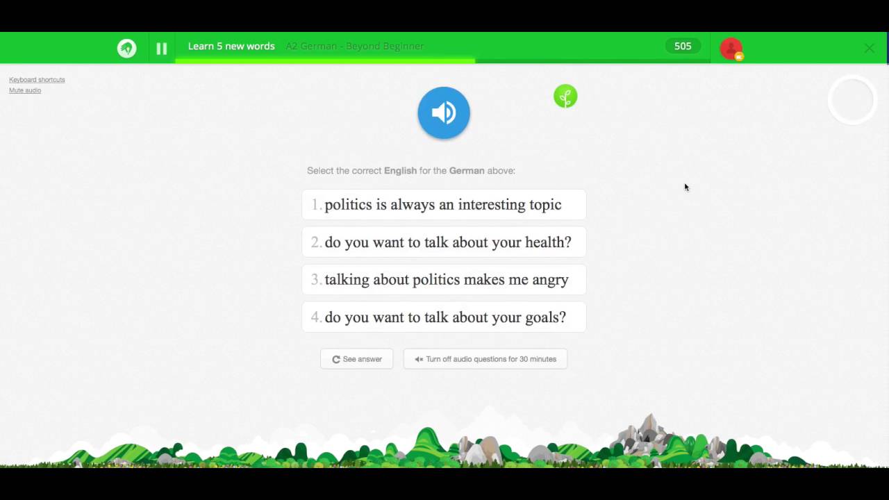
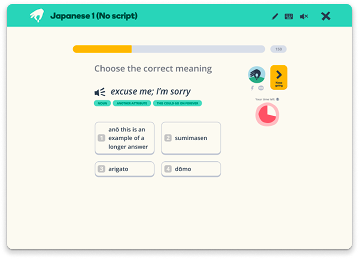
The learning session is the heart of Memrise. It’s where users actually learn, testing themselves across five different core test types, with content that varies hugely: text, audio, video, and input methods ranging from multiple choice to audio recognition to free text. Any redesign had to account for all of this variation while keeping the experience coherent.
The goal wasn’t to reinvent what made Memrise work. Users came to us for a particular feel, and we needed to retain that. But we could advance the visual language, tighten up the inconsistencies, and build in the kind of polish the old sessions lacked. We wanted to unify the UI in a way that could serve as a jumping-off point for a full-scale overhaul of components and patterns across all platforms, not just the web. Delightful interactions, clear brand language, and a consistent foundation that could scale.
One of the joys of the rebrand was that it embraced the inherent wonkiness of Memrise. The brand had always felt playful and tactile, and the new visual identity leaned into that rather than smoothing it out. We carried this into the session redesign: keeping things clean and modern, but not sterile. There’s a looseness to the interactions and the layout that feels distinctly Memrise.
We needed to move quickly, but not recklessly. Testing and iteration were baked into the process from the start.
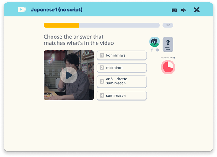
The new learning session is a clean, modern experience that feels like Memrise.
Rebuilding the design system
Like the web platform itself, Memrise’s design system had fallen into neglect. Rather than trying to patch what existed, we used the replatform as an opportunity to rebuild the core component library from scratch. Every new element we created for the learning sessions was designed to be scalable and componentised, built in Figma and in code simultaneously, and documented as we went.
To make sure the system would hold up beyond this one project, I brought all proposed components to the wider design team via weekly design critiques. The goal was to gather as much feedback as possible before anything was locked in, surfacing edge cases and potential issues early rather than discovering them later when we tried to roll the system out to other platforms.
I also changed how we worked with engineering. Instead of handing off static component designs and hoping for the best, I coded up working versions of each component myself. This meant interactions were clearly demonstrated rather than described, all states were accounted for, and important accessibility considerations like keyboard navigation were built in from the start. It removed ambiguity and gave developers a reference implementation they could build from with confidence.
The new learning session is a clean, modern experience that feels like Memrise.
Iterating through user testing
We ran fortnightly user testing sessions throughout the project, treating it as a regular cadence rather than a one-off validation step. We pulled from our existing community of power users, but made a point of talking to non-users too. It would have been easy to design purely for the people who already loved Memrise, but that risked missing problems that were obvious to fresh eyes.
We tested using coded prototypes rather than static designs, hooking into our existing database so we could use real course material. This meant tests reflected how the experience would actually work in the wild, with all the variation in content length, media types, and edge cases that entails.
The testing surfaced things we wouldn’t have caught otherwise. Early on, we’d radically rethought how video tests worked, opting for something that felt more like TikTok. In testing, we learned we’d pushed things too far. Users found the shift jarring when moving between test types, which broke the flow of a session. We reined in the design to keep things cohesive.
Testing also revealed that users didn’t necessarily know about standard features like skipping. We’d assumed certain interactions were obvious, but they weren’t. This prompted us to rethink our microcopy, make buttons clearer, and add visual prompts when a user sat idle on a single screen for too long. Small changes, but the kind of thing that only surfaces when you watch real people use your product.
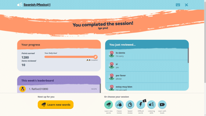
The new end of session screen, taking all of the feedback of things users fed back to us during testing.
Conclusion
What started as a technical replatform became something much more significant. By treating the migration as an opportunity rather than just a chore, we delivered a redesigned learning experience that brought Memrise’s new brand to life, rebuilt a neglected design system into something scalable, and established patterns that could roll out across all platforms. Post-launch, we saw a 26% increase in user retention on the web.
The process reinforced a few things I already believed: that replatforms are rare opportunities to fix accumulated design debt, that coding your own prototypes removes ambiguity and builds trust with engineering, and that regular user testing catches problems no amount of internal review will surface.
The web platform went from being a source of frustration to a proof point for what Memrise could be. Sometimes the unloved thing just needs someone to care about it.
