
Baseline Design System
Introduction
Baseline started as a simple enough brief: create a sample design system that zeroheight could use for demos. But a basic starter kit wasn’t going to cut it. To be genuinely useful, it needed to reflect the reality of what our customers are building: large-scale, enterprise-level systems with multi-brand architectures, complex component libraries, and proper token pipelines feeding real code.
So that’s what I built. Baseline is a fictional fintech SaaS company with three distinct brands, over 10,000 component variants, a fully automated design-to-code token pipeline, a React component library published to NPM, and comprehensive documentation covering everything from accessibility guidelines to UX patterns. It’s a design system that could ship a real product. And I built the first version of it in three weeks.
That was the easy part. The six months since have been about the harder question: does any of this actually hold up when you try to build something with it? To answer that, I built a complete demo app on top of the system, using MCP and Claude Code to design and develop against the documentation rather than around it. The app surfaced gaps I’d never have found from inside Figma, and fixing them made the system meaningfully better.
This case study walks through how I approached the project: establishing the foundational architecture, designing a scalable component library, solving workflow problems with custom tooling, packaging everything for developers, documenting it all in a way that’s useful for both humans and AI, and then putting the whole thing to the test.
Establishing the foundations
Before touching a single component, I needed to establish what this system was actually for. The brief was clear: create a design system that mirrors what zeroheight sees across our customer base: large enterprise tech companies, typically running multi-brand setups with all the complexity that entails. This wasn’t going to be a simple starter kit. It needed to feel real, with the kind of architectural decisions that only emerge when you’re designing for scale.
I landed on a fictional fintech SaaS company as the foundation, which gave me room to create three distinct brands under one umbrella. Baseline is the core product brand, Baseline Pro is a premium tier within that core offering, sharing DNA but with its own elevated personality, and then there’s Offset, a consumer-facing payments brand that needed to feel approachable and, for lack of a better word, fuzzier than its siblings.
The variable setup in Figma was where the real groundwork happened. I built out a three-tier token architecture – comprising primitive, semantic, and component layers – with brand theming handled via modes at the semantic level. This means any component can switch between Baseline, Baseline Pro, or Offset with a mode change, inheriting the right colours, typography, and spacing without any manual overrides. It needed to be scalable, but more importantly, it needed to demonstrate best practice for how teams should actually structure their variables.
With the architecture in place, I worked through all the standard brand elements you’d expect from a real-world system: colour palettes, typography scales, spacing and sizing tokens, and a full icon set. I also built out the practical stuff that often gets overlooked in sample systems: logos, imagery guidelines, and landing pages that show how everything comes together in context.
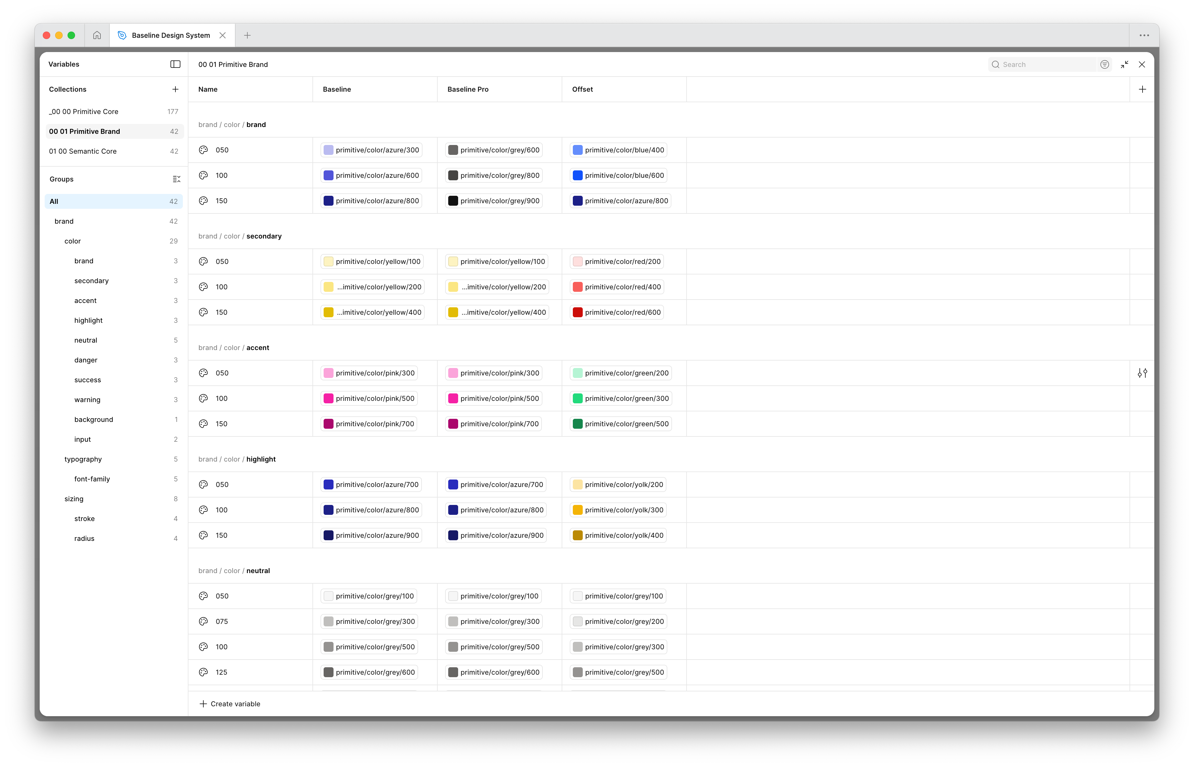
Semantic variables in Figma. I laid out the foundation of the design system in a three-tier architecture, with brand theming handled via modes at the semantic level.
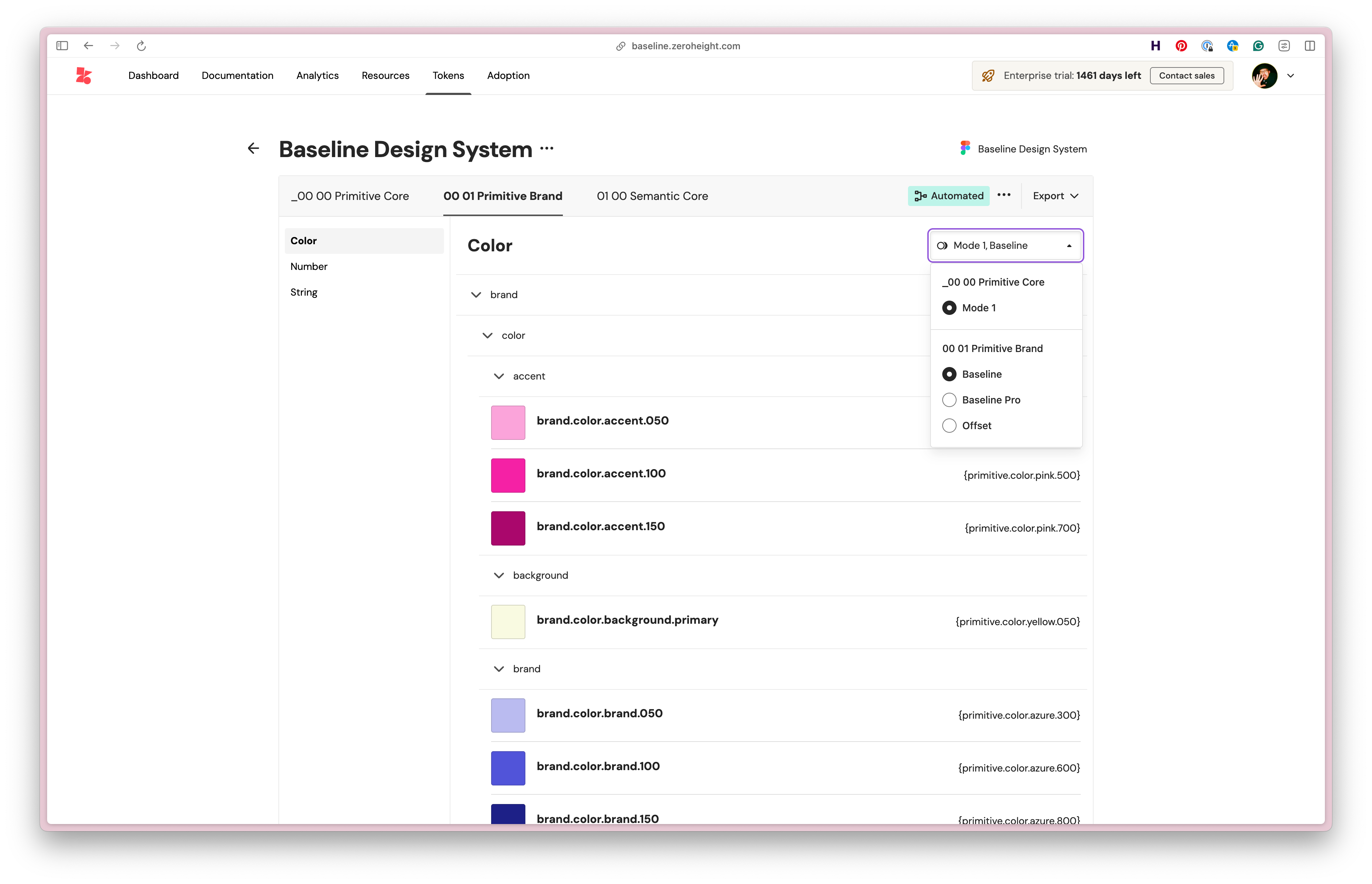
The variables are pulled in dynamically to zeroheight to convert to design tokens, so they can be used in Style Dictionary.
Designing the system
With the foundations in place, I moved on to building out the component library itself. The goal was to create a full set of components you’d typically expect in a SaaS product: buttons, inputs, navigation, switches, steppers, sliders, the works. Nothing revolutionary in terms of what’s included, but the ambition was in how they were built.
Rather than creating the simplest possible version of each component, I wanted to mirror the complexity I’ve encountered building components in the real world. That meant breaking everything down into its atomic pieces and building back up from there, with smart options exposed as props so each component could flex to cover a wide range of use cases. A button isn’t just a button. It’s a considered system of sizes, states, icon positions, and variants that all need to work together without falling apart. By the end, the library contained over 10,000 different component variants.
The text input is a good example of this approach in action. What looks like a single component is actually a carefully orchestrated set of elements: labels, hints, icons, validation states, character counts, all wired up so you can toggle options on and off without breaking the underlying structure. It’s the kind of complexity that’s invisible when it’s working well, but falls apart quickly if you cut corners.
I also knew from the start that this system would be used to demonstrate zeroheight’s Figma MCP alongside our own MCP, showing how AI tools like Cursor and Claude Code can generate interfaces from well-structured design systems. That meant everything needed to be rigorously tokenised and thoroughly documented. If the tokens are messy or the naming is inconsistent, the AI output suffers, so this became a forcing function for maintaining quality throughout.
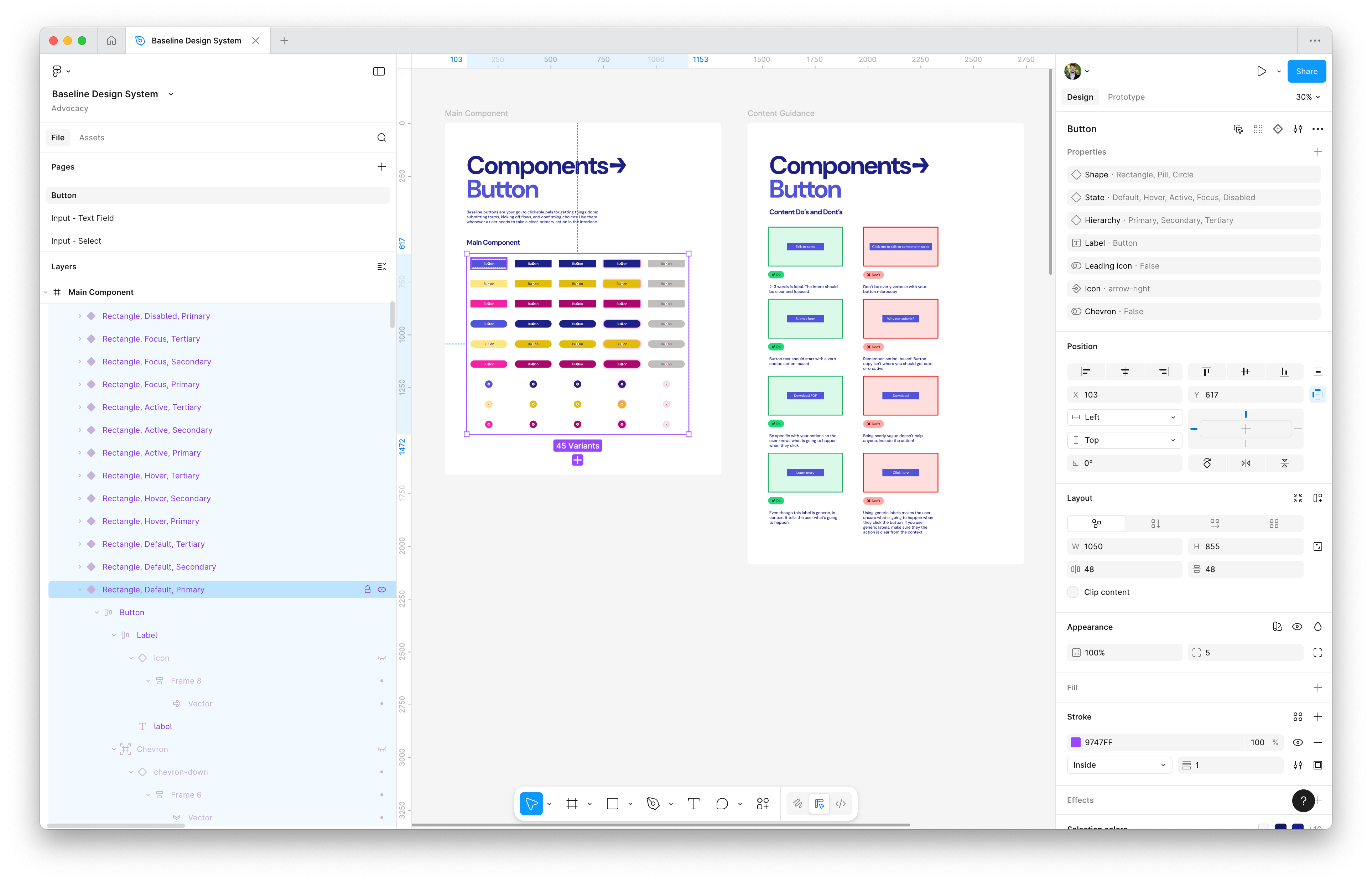
The Button component in the Figma library, with variants and booleans to control the variations on the component. I also include paired down guidance that's important for designers when using the component.
Finding and fixing the problems
Building a system of this scale inevitably surfaces friction. Small annoyances that you can ignore on a simple project become genuine blockers when you’re repeating the same task dozens of times. Rather than just pushing through, I decided to solve a couple of these problems properly by building small, focused Figma plugins.
The first issue was creating variables for the colour ramps I’d established for each brand. Converting colours from the canvas into properly structured variable collections is tedious, repetitive work. There are existing plugins in the community that help with this, but none of them handled the specific workflow I needed. So I built my own. It’s a simple tool, but it saved a couple of hours of manual work and is now being kept internal as a utility for the zeroheight team.
The second problem came from how I was using boolean properties to control component variants. I needed a way to visualise all the possible combinations as instances on the canvas, and crucially, to name and format them correctly so they’d import cleanly into zeroheight. Again, there were community options available, but nothing quite satisfied the requirements. This plugin had a bigger impact: it saved me one to two days of manually creating and naming component instances. Unlike the first, I’ve published this one to the Figma community as the zeroheight Instance Creator.
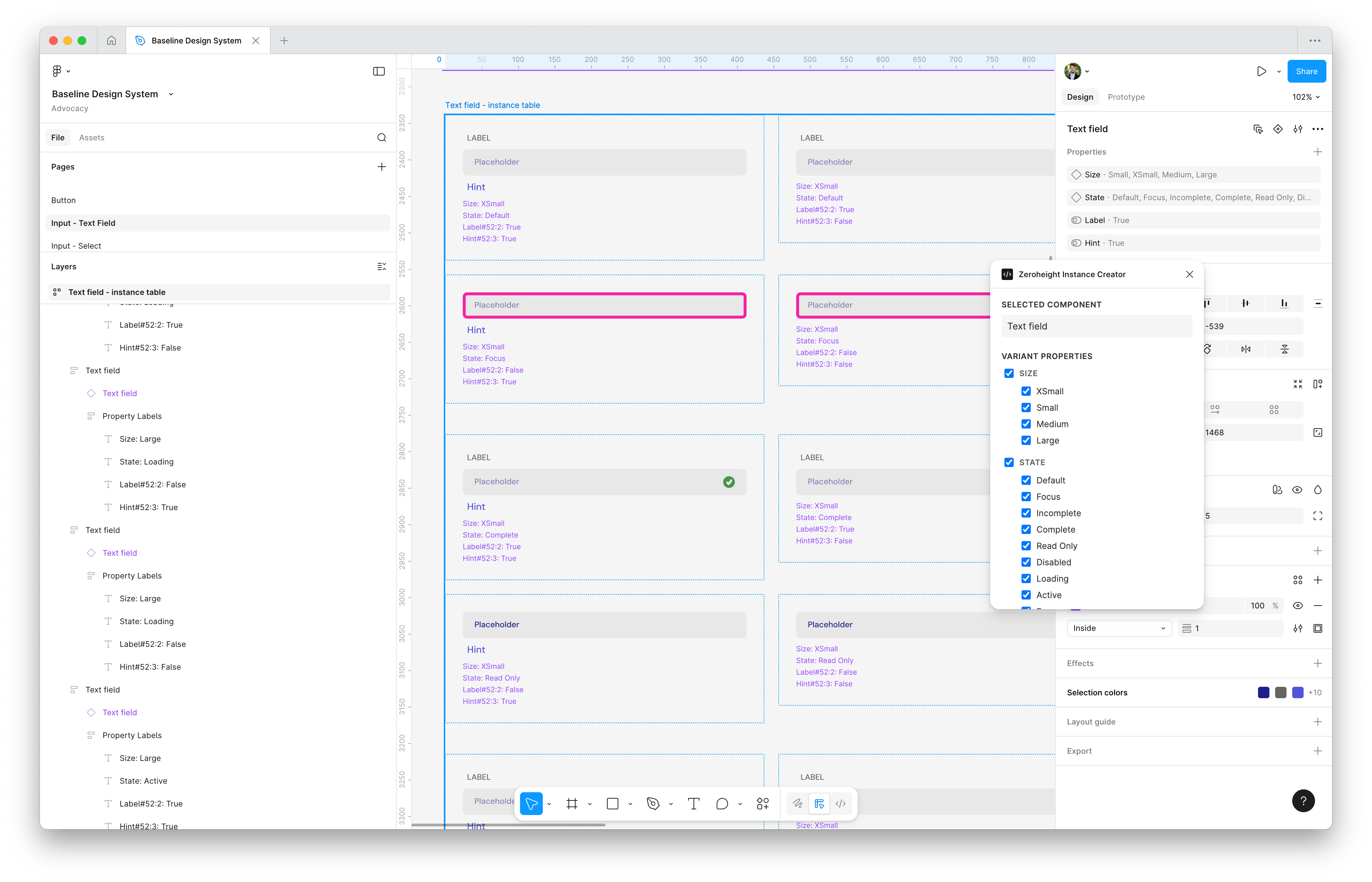
The zeroheight Instance Creator takes all of the variants and boolean properties on a component and creates a new instance for each combination.
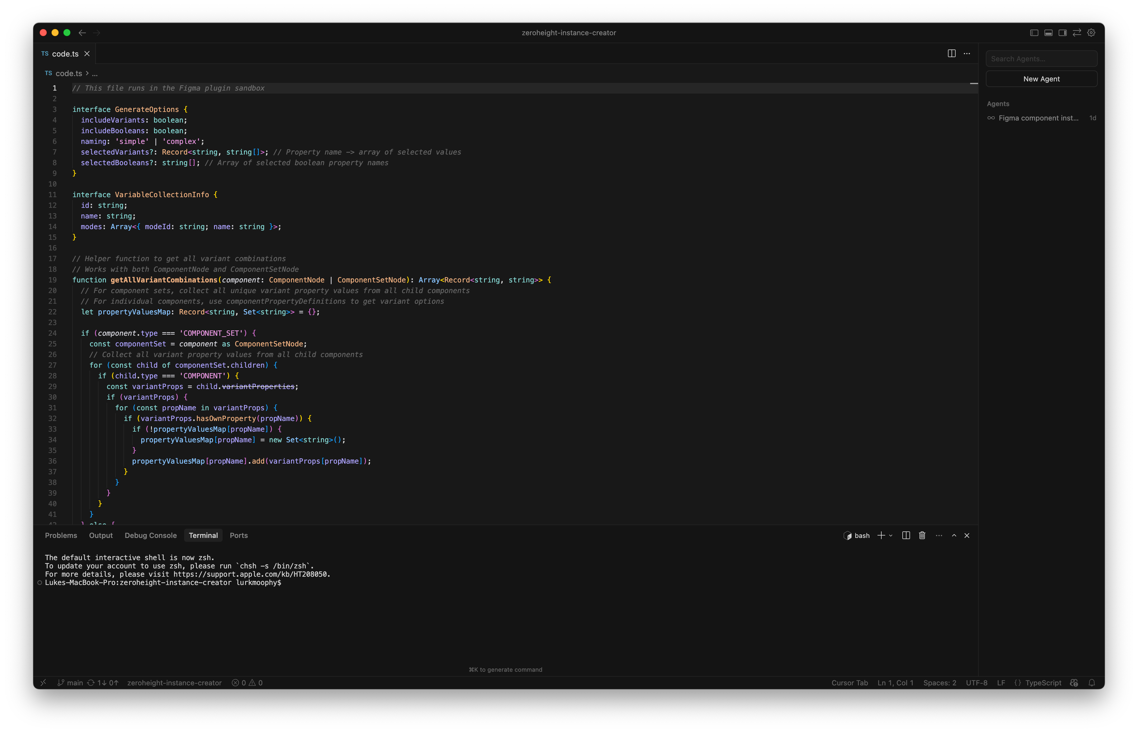
I created the simple plugin using the Figma API and JavaScript.
Packaging up for delivery
A design system only really proves itself when it’s running in code. The Figma library was comprehensive, but it needed a production-ready counterpart to demonstrate the full value of what we’d built.
The first step was establishing a variable-to-token pipeline using zeroheight and Style Dictionary. The goal was a fully automated process: variables defined in Figma would be translated into tokens in zeroheight, then transformed via Style Dictionary into CSS variables ready for use in real components. This meant getting into the weeds of Style Dictionary transforms and building custom scripts on top of the standard tooling to make sure the output made sense to developers. Token pipelines can get messy quickly, so I wanted this to be a clear, replicable example of how to do it well.
From there, I built out all the components as React components, packaging everything up as an NPM package that could be served to consumers. These needed to be properly architected, functional components with real interactivity, not just styled rectangles ported from Figma. The kind of thing a developer could actually drop into a project and use.
To surface all of this, I created a Storybook instance that documents every component and its available props, complete with working interactions. I also built in a brand switcher that lets you toggle between Baseline, Baseline Pro, and Offset, demonstrating the token architecture in action. Switch brands, and the entire component library updates to match.
Finally, I created Code Connect files for every component. This ties the Figma components directly to their code counterparts, which becomes essential when using the Figma MCP to generate sample screens. The AI knows exactly which component to reach for and how to use it.
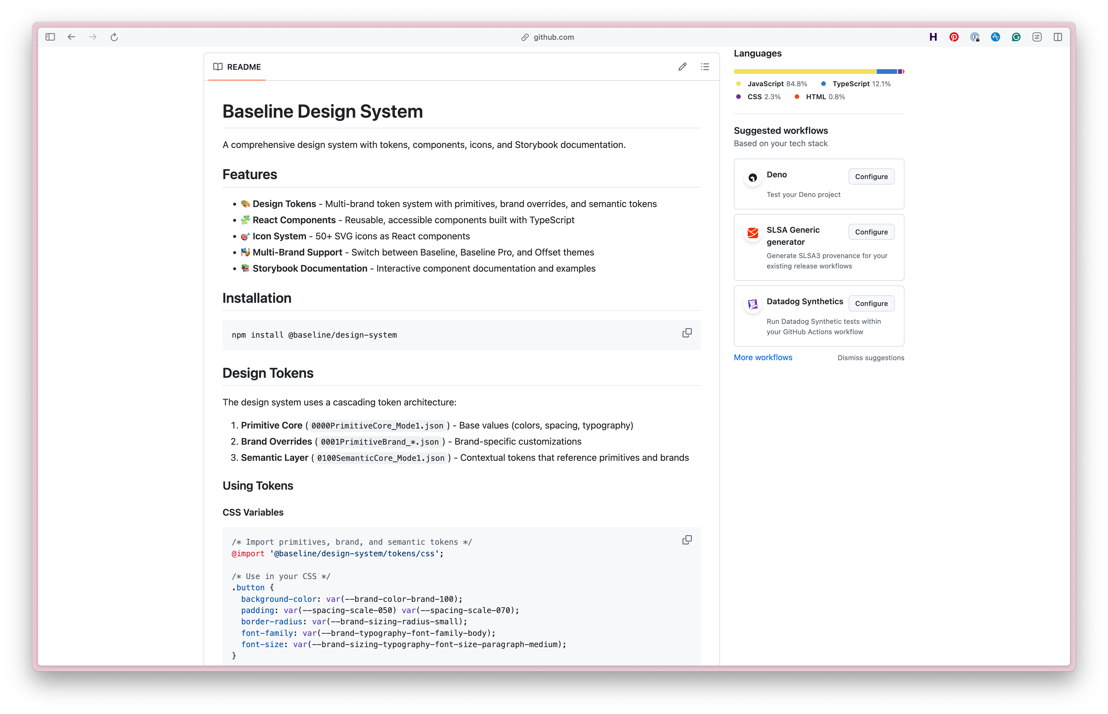
The Github repo includes the NPM package, the Storybook instance, and the Code Connect files for each component.
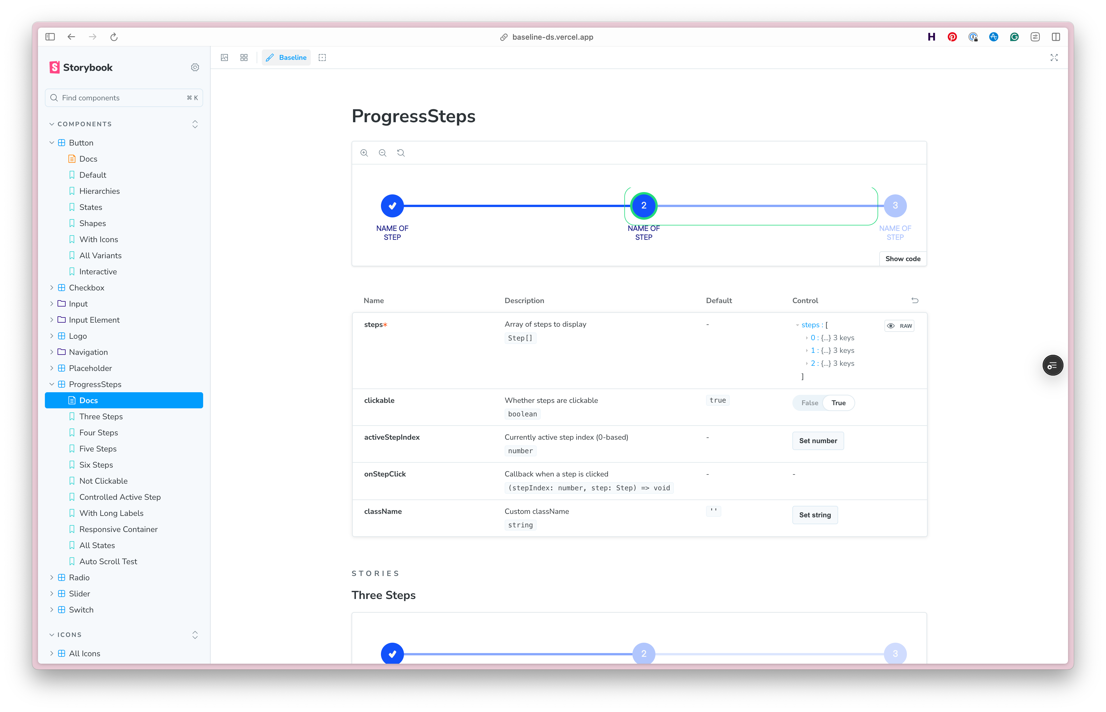
The Storybook shows the components in action, with working examples and props for each variant.
Documenting the design system
With the design and code work complete, the final stage was bringing it all together in zeroheight. This was an opportunity to showcase as many platform features as possible: theming, design blocks, token blocks, component sets, status tables, and more. But beyond feature coverage, I wanted to demonstrate a thorough approach to component documentation that would prove its value when connected to the zeroheight MCP.
Each component documentation page follows a consistent structure. Design guidelines cover the visual and interaction principles. Content guidelines address the language and tone for labels, hints, and error messages. The code section surfaces the React implementation with working examples. Token usage explains which tokens are in play and how they map to the component’s visual properties. Accessibility guidelines document keyboard interactions, ARIA requirements, and any specific considerations for assistive technology. Finally, a feedback section provides a channel for questions and improvements.
This structure isn’t arbitrary. When an AI tool queries the MCP to understand how to use a component, it needs more than just a prop list. It needs context: when to use the component, how to write for it, what accessibility requirements apply. The documentation becomes part of the system’s intelligence.
Beyond component pages, I also created a set of sample UX patterns, a section that’s often overlooked in design systems but invaluable for showing how components combine to solve real problems. Extensive foundational guidelines round out the documentation, covering everything from colour and typography to spacing and iconography.
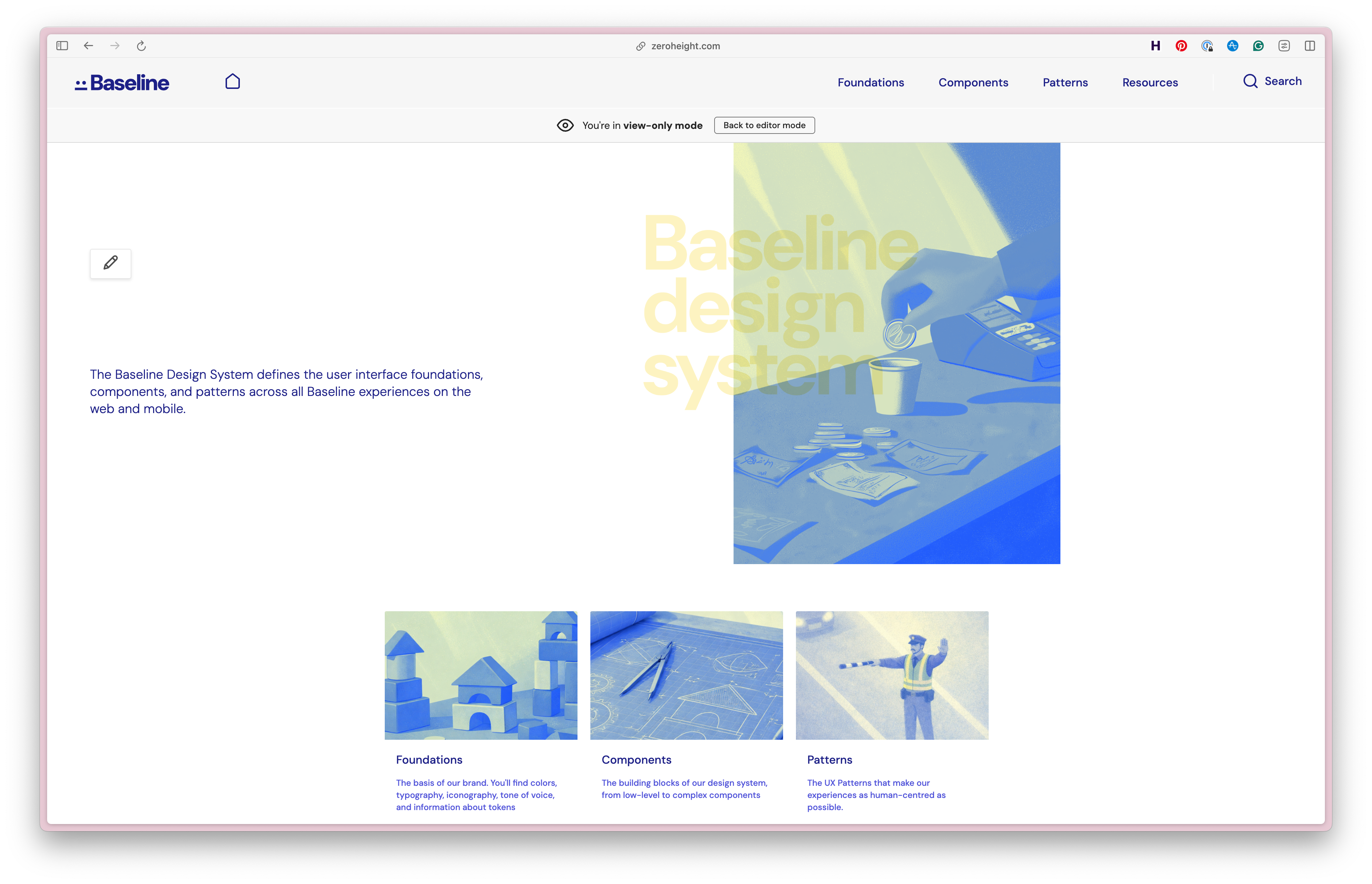
The zeroheight cover page for the design system, with custom imagery to make it feel more like a real product.
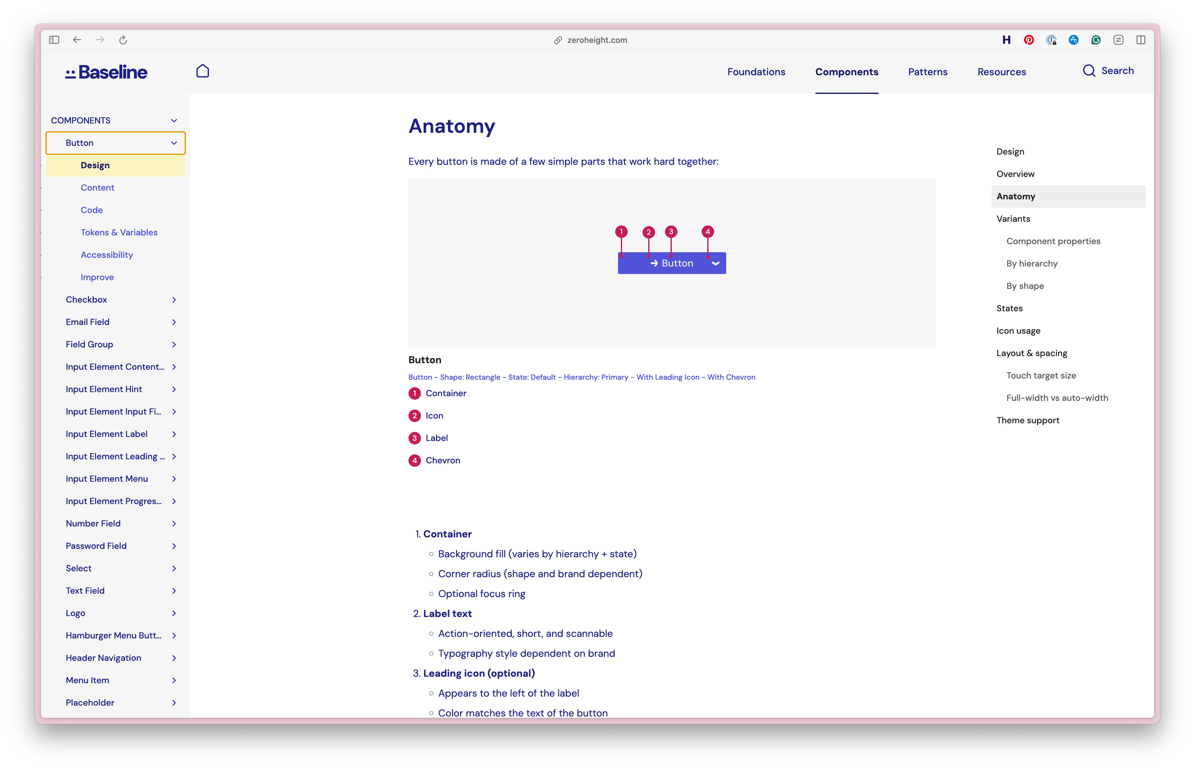
The zeroheight documentation page for the design system, showing guidance for design and content, as well as the code and token usage for each component.
Building something with it
A design system proves itself in documentation, but it only really earns its keep in a product. Storybook shows you the parts in isolation. A component page tells you how a button should behave. Neither tells you what happens when someone actually sits down to build a screen and discovers the system has no opinion on how a data-heavy dashboard card should be composed.
So I built one. The Baseline demo app is a working fintech dashboard: account overview, balance and net flow summaries, transaction history, and a set of quick actions. It’s built entirely from the published NPM package, running on the same token pipeline, and it brand-switches between Baseline, Baseline Pro, and Offset like everything else in the system.
The app itself wasn’t really the point, though. The point was the workflow. I wanted to demonstrate, concretely, what changes when you design and develop against a well-structured design system with AI in the loop, rather than asking a model to invent an interface from scratch.
The setup wires three things together. The zeroheight MCP exposes the documentation: not just prop lists, but the design guidance, content guidelines, token usage, and accessibility requirements written into every component page. The Figma MCP exposes the design library and, via Code Connect, the mapping between each Figma component and its React counterpart. Claude Code sits on top of both, with the NPM package installed in the project.
The difference this makes is stark, and it’s the thing I most wanted the app to show. Ask a model to build a fintech dashboard cold and you get something that looks plausible and is probably wrong: an invented spacing scale, colours that nearly match the brand, a bespoke card component that duplicates one you already have, and no consideration of focus states or contrast at all. It’s the same failure mode as a designer who’s never opened the library. Ask the same question with the MCPs connected and it queries the documentation first. It reaches for the documented component instead of building a new one, uses the semantic token rather than a hex value, follows the content guidelines for the labels, and inherits the accessibility work that was already done once, properly, at the component level.
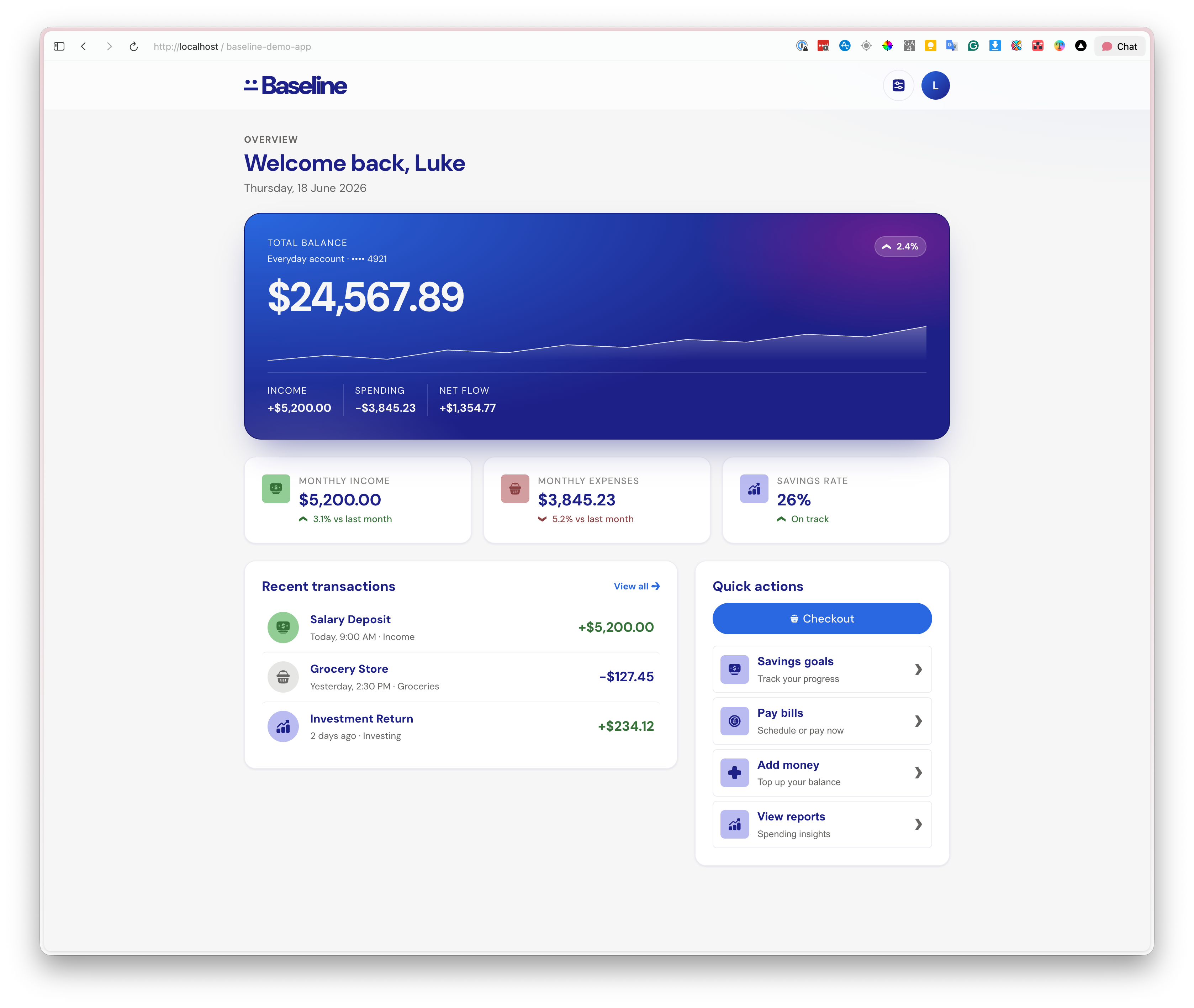
The Baseline demo app. Every element on this screen comes from the published component library, styled by the same tokens that feed the Figma variables, and generated with Claude Code reading the documentation through MCP.
Six months of refinement
Building the app was the forcing function, but a lot of the work since has been slow and steady improvement. It’s building something that everyone from marketing, product, sales, and customer success can use to demo and dogfood zeroheight and the MCP, building something that looks and feels like a real product.
- Components: since we started, we’ve added in new components, as well as reworking existing ones to make them more flexible and useful. New components include cards, charts, alerts, and more.
- Tokens and theming: We started with a relatively simple token setup. Since then, we’ve added in stronger base foundation stylings, including a full grid layout system, as well as motion and interaction tokens to keep it all consistent.
- Documentation: The documentation is where a lot has changed. We’ve improved component guidance, including automated code documentation, and added in agent-specific documentation to help the MCP understand the context of the component. I overhauled the foundation guidance, making sure that our typography, colour, and grid layouts are well documented and easy to understand. I also established some base code guidelines to allow the MCP to generate code that’s more consistent and easier to maintain.
- Usage: The app is now used in sales demos, product demos, and customer success meetings to help the team understand how the system works and how it can be used. It’s also used byt he product team to dogfood new features, like the upcoming Agentic feature. It’s become an essential resource for the team to understand how the product works and how it can be used.
Nearly every improvement came from using the system rather than from planning it.
Conclusion
Baseline ended up being a much larger project than I initially anticipated, but that scope was the point. A sample system is only valuable if it demonstrates real complexity, and real complexity forces you to make the same hard decisions your customers are making every day. The three-week build kept things focused: every decision had to earn its place.
What the six months since have taught me is that the build was the shorter half of the job. Designing a system is mostly a set of bets about how things will be used, and you don’t find out which bets were wrong until something is genuinely consuming the system. The demo app collected those debts in a hurry, and paying them off is what turned Baseline from a convincing artefact into something that holds together under use, especially when used by people who aren’t paticularly used to working with design systems (like our Sales and Success teams).
Building it gave me a deeper appreciation for the full lifecycle of a design system: the architectural choices that either scale gracefully or become painful, the tooling gaps that slow teams down, and the documentation that transforms a component library into something people can actually use. That last point has only got sharper. When AI tooling is reading your documentation through MCP, the quality of what you’ve written stops being a matter of politeness to the next designer and starts directly determining the quality of what gets built. Careful documentation has always paid off eventually, but with AI tooling, it pays off immediately.
The system continues to evolve, but at its core, Baseline is proof that doing things properly pays off, even when the brief would let you get away with less.
